The Apple Watch
It's no secret that I'm an Apple nerd. So when the Apple Watch was announced most people assumed I'd get one. Thanks to new IRS guidelines for qualified health spending we discovered we could use our health savings account to purchase two of them (more on the health side effects of an Apple Watch later).
I'd read a bunch of reviews from people I trust and knew the pros, the cons and limitations before I bought one. But reading about one and owning one are two different things. Below are my initial impressions after owning the watch for a couple of weeks.
Ordering
Ordering was easy. Getting it once we'd ordered? That wasn't so fun. Either Apple underestimated the demand, had trouble meeting the demand or something else I can't guess, but it was a bit of a mess. We ordered April 29th and AJ received hers a month later and mine came two weeks after hers. For most of the time our tracking said, "Ships in June".
Setup
Setup was very unique. Basically your watch produces a beautiful (unique?) hologram-esque image that your phone takes a picture of via the Watch app on your iPhone. Wait a bit, wait a bit longer and your watch is ready for use.
Orientation
I'd read Craig Hockenberry's suggestion of wearing the watch in a reverse crown orientation and was instantly intrigued. Craig's a smart guy and spends a lot of time thinking about usability. In my imagination, his suggestion totally worked and so out of the box I setup my watch that way. That didn't last long as I found my thumb was not a great digital crown manipulator and quickly reverted to the regular way of using the watch.
Using the Watch
Using the watch takes a little getting used to. But I think that's mostly because we have been trained to use touch screen Apple devices for years now. It's tempting to use the digital crown in the same way you use the home button on your iPhone/iPad but that's not a perfect analogy.
There are similarities between using the watch for the first time and using the original iPhone for the first time. When the iPhone came out there were new interface metaphors to get used to. We were rewarded with delight while getting used to pinching to zoom and swiping to scroll but it was still a little disorienting. Disorienting, not because it was hard to use, but because it was unfamiliar. I remember having a sinking feeling that I could potentially be missing out on a feature because I wasn't familiar enough with how the phone worked. Using the watch gave me a similar feeling of déjà vu.
Take for example the watch's force touch feature. In some apps, pressing firmly on the screen brings up another menu, not accessible via normal onscreen options. While this is brilliant, it also leads to "options anxiety"; what if there are other yet-to-be discovered menus hidden behind a force touch? John Gruber discovered yet another hidden option - long touching (not to be confused with force touching) the color palette in the digital touch menu will lead you to a color picker. This is not documented anywhere (to my knowledge) and could've remained undiscovered if I hadn't followed John on Twitter. None of this is bad of course, but in the last few weeks of owning the watch, I've been reminded of the first few weeks with the original iPhone.
In reading some of the early reviews, I was led to believe that the digital crown usage (press once to turn on, press once to return to watch face, press once to go to app launcher screen, press once to center app launcher screen) was complicated. It is on paper but not in real life after a couple of days. This is primarily where the digital crown = iPhone home button comparison breaks down.
The Home Screen
The home screen on the iPhone is where everything begins. It's the center of attention when you are not using an app. You'd think, given that the watch also has a home screen with app icons that can be rearranged, that this is where everything starts on the watch, but that's not the case. I've found that the watch face is where everything starts - it's the default screen that loads when you raise your wrist (unless you change it in settings of course). I find that most of my interaction is with this screen. I launch the most common apps I use straight from this screen using the complications (tiny icons that relay information from apps like weather, calendar or fitness). The rest of the apps I regularly launch are launched from the glimpses screen.
Apps
Speaking of apps, the built in apps are beautifully crafted. Again, there's a nod back to the iPhone. The original iPhone launched with no app store, so you were stuck with Apple's stock apps and they were brilliant. Highly polished, did what you think they would and were full of clever little touches. It was a limited device. So is the watch. And that's not a bad thing. It's far easier to get to grips with a device that you understand and can comprehend its limitations than something that is unwieldy where you are left wondering what it's for.
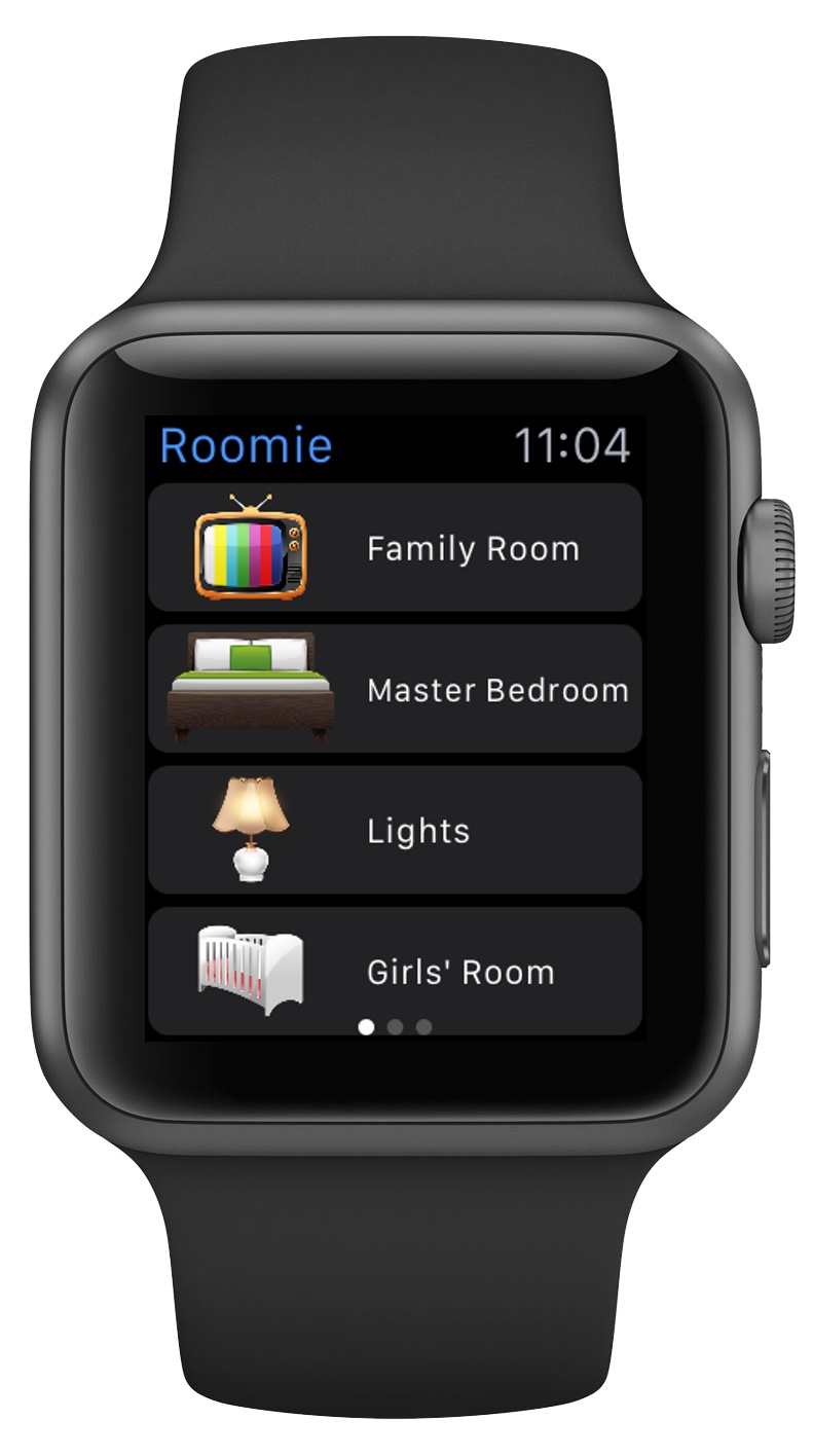
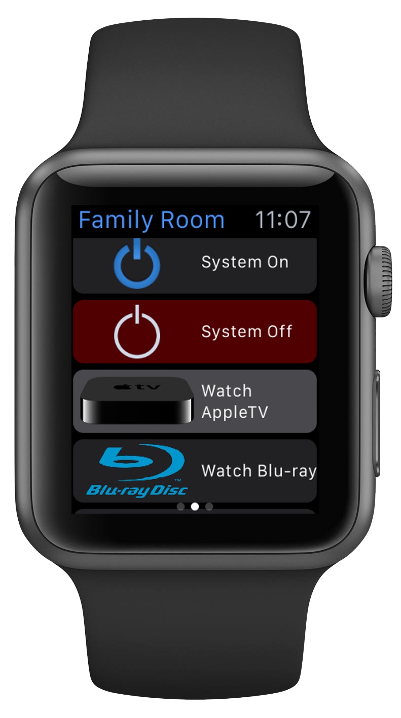
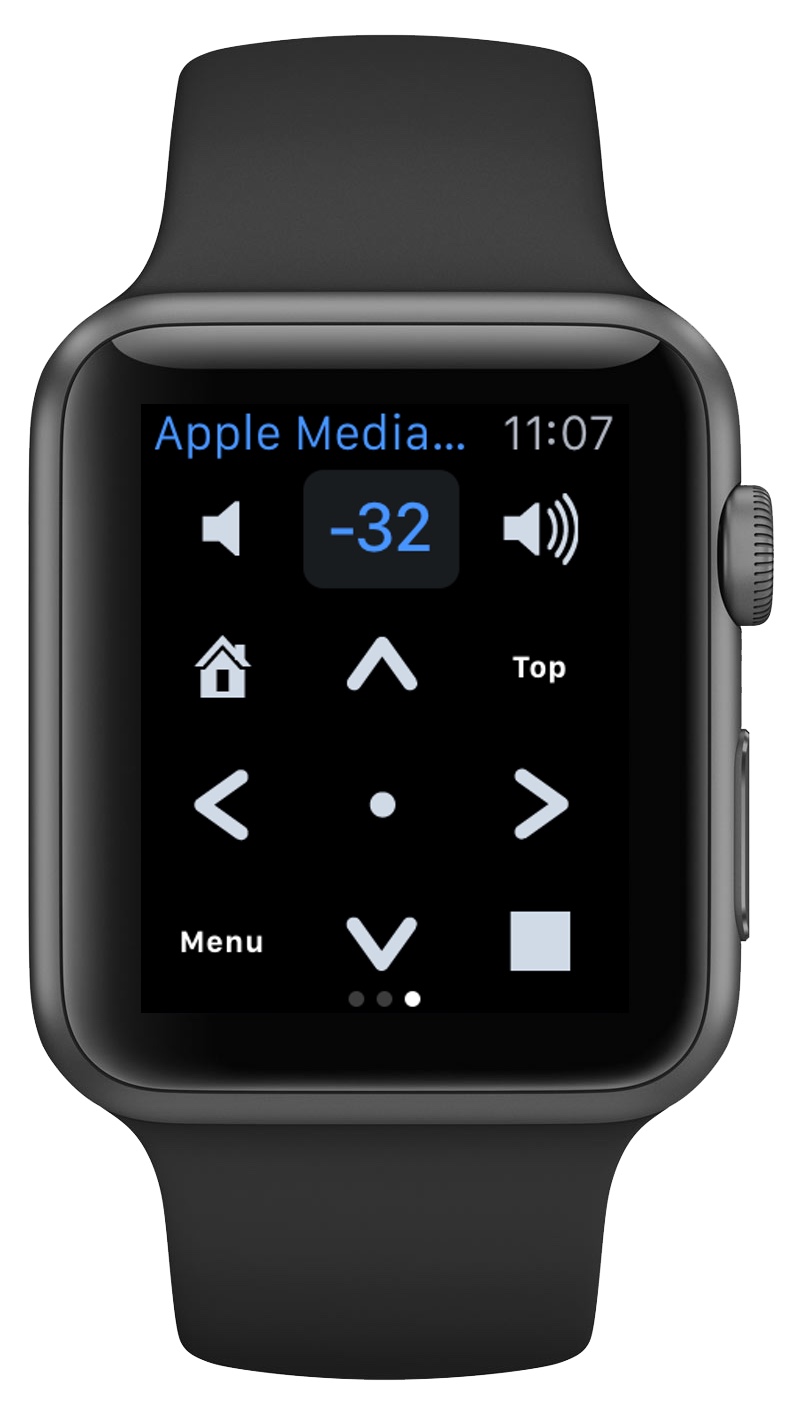
So the stock apps are nice. The third party apps are a bit of hit and miss really. On any given day, my third party apps will just stop working. I haven't managed to determine why or how to get them working again. Thankfully more often than not, they do work and actually I've found tremendous use in some of them. I'm a big user of Roomie Remote for example and when it loads on my watch it's a killer device. It literally feels like I am in the future controlling all of my audio visual equipment (plus my lights and thermostat) from my watch.
Of course we're bound to see this improve when watchOS 2 is released in the fall. Again, my third parallel to the original iPhone is regarding apps. Before the App store launched on the iPhone we were given "web apps" for iPhone. They were a crumby compromise (especially in light of what came after them) and I suspect we'll look back on the current third party watch solution in a similar fashion once we get "proper" watch apps.
Battery Life
In several weeks worth of use, I've yet to run out of battery. This includes the days I've had late bed times. Even at 2am there's still juice running in my watch and I've never had to worry. So much so that I stopped using the battery complication to check on battery life - it's simply not an issue.
Siri
Weirdest thing about using the watch so far? Siri on the watch does not speak back to you. After years of hearing Siri speak, it's so weird to not hear Siri's voice on the watch. Yes, Siri is faster, yes Siri is handy, but again - similar to the original iPhone - you find yourself having to learn to use the watch in new ways. For example, today I had to make a phone call. I thought I'd initiate the call from my watch but found it odd that the phone app didn't have a dial pad. You can call your favorites, anybody you've called recently or any of your contacts but you can't dial a number. "That's odd", I thought and picked up my phone and dialed the number the old fashioned way. It was only once I hung up I wondered if I could've called the number via Siri. Totally could've.
Digital Touch
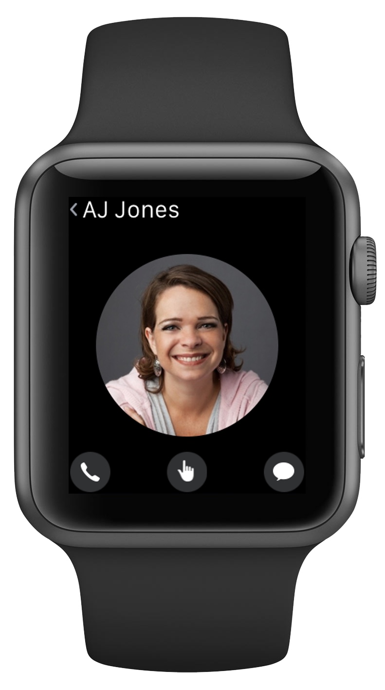
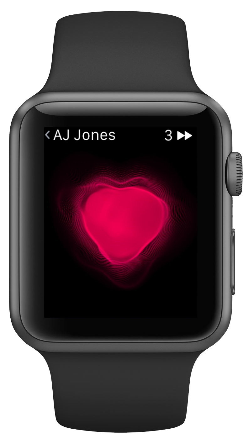
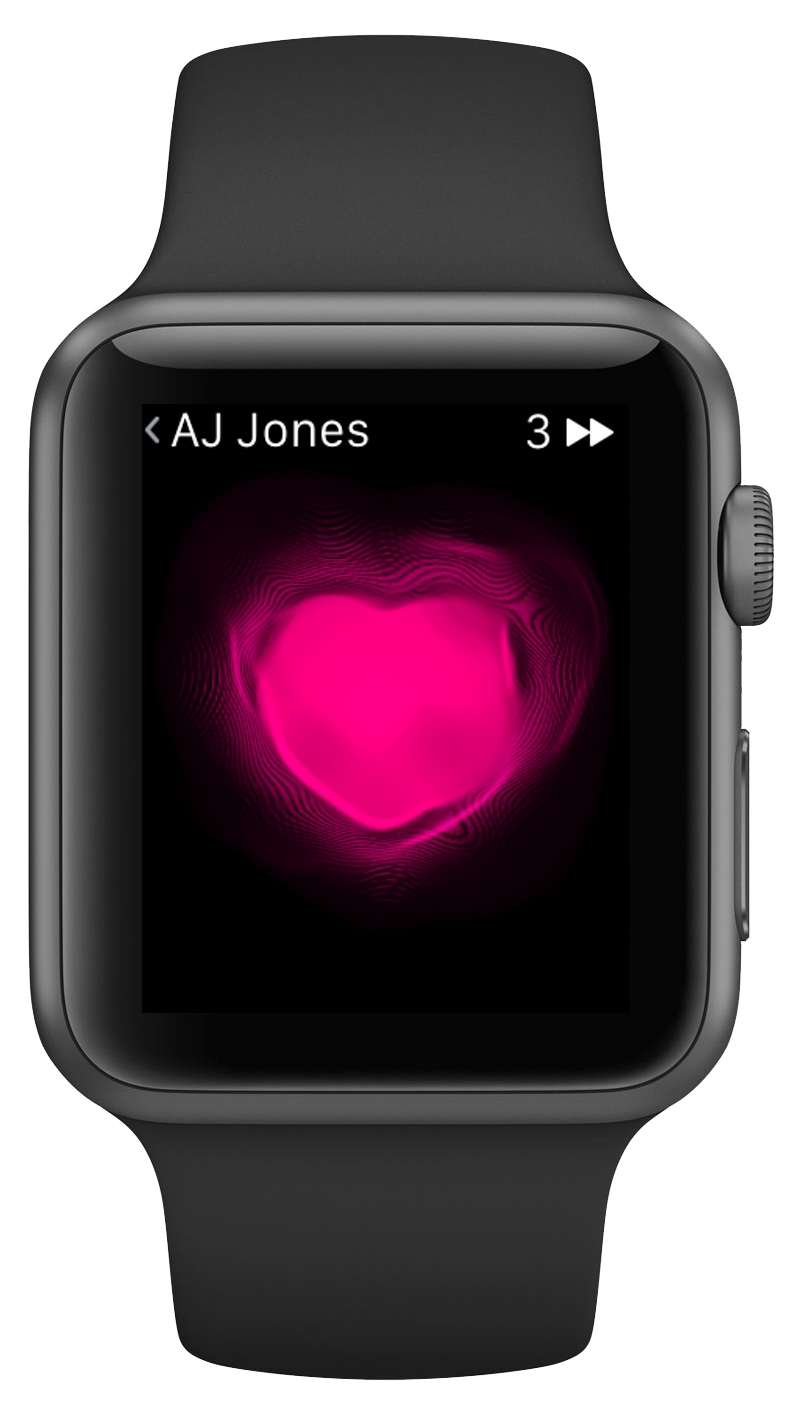
Promoted by Apple as their most personal device yet, the marketing materials for the watch stress the "new dimension to the way you communicate" and our ability to use the watch to say things "with feelings". Sounds like marketing hyperbole right? You've probably heard about the feature that lets you send your heartbeat to other Apple Watch users. This sounds frivolous and yet in my experience I've found it's something quite special. Put it this way, I know four other people with Apple Watches and yet I've only sent my heartbeat to one of them: my wife.
The first time we tried sending our heartbeats to one another we were genuinely surprised how it felt; not just physically via the watch's taptic engine but also emotionally. It really is an intimate and private way of communicating affection. It's turned out to be one of my favorite features of the watch.
Health & Fitness
This is the area I was most interested in exploring. I'm not what you'd exactly call athletic. I've never enjoyed physical exercise for the sake of exercise and most efforts at trying to exercise regularly have failed spectacularly. Obviously I am aware of the tremendous health benefits that exercise brings, but for whatever reason I've never done anything with that knowledge.
For all my lack of physical prowess, I do have a desire to complete things. Take for example video games. I don't just want to complete a level, I want to finish and pick up all the bonus challenges, the stars, the coins, the rewards (which is why I am still trying to finish Champion's Road in Super Mario 3D World).
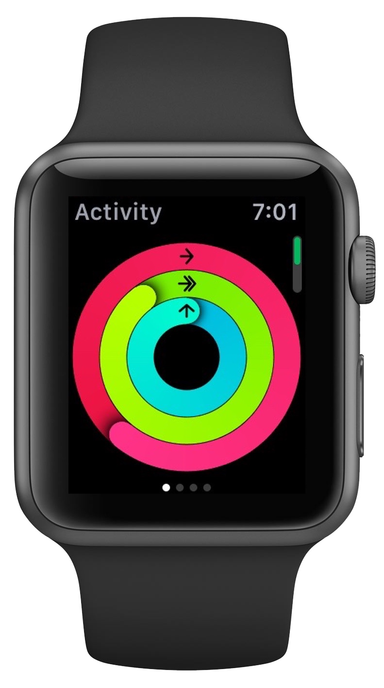
So despite the fact that external motivation doesn't seem to have an impact on me, I'm aware that there's an intrinsic motivation at work. So does Apple apparently because their inclusion of three little rings on the watch has changed my daily activity drastically.
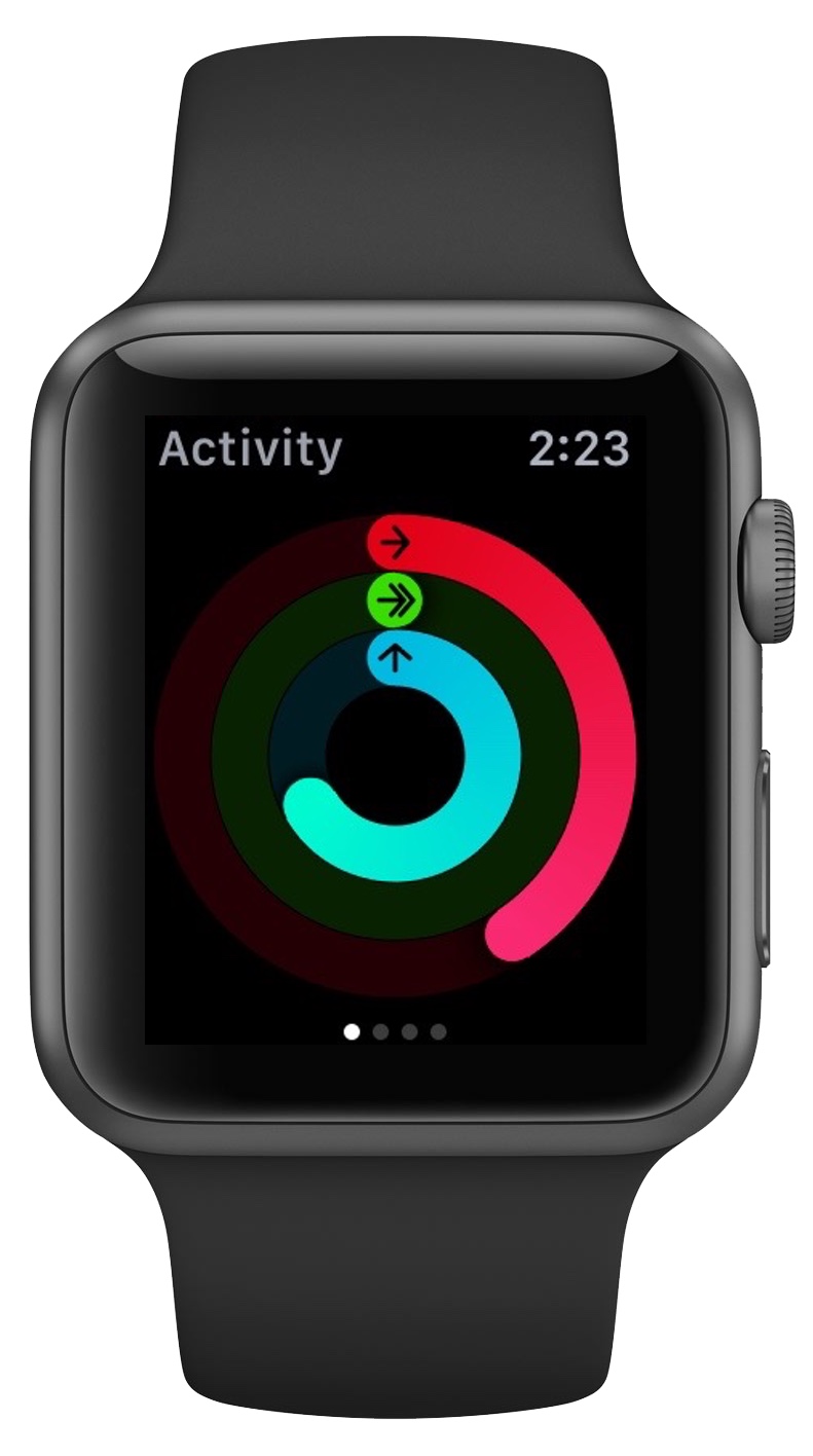
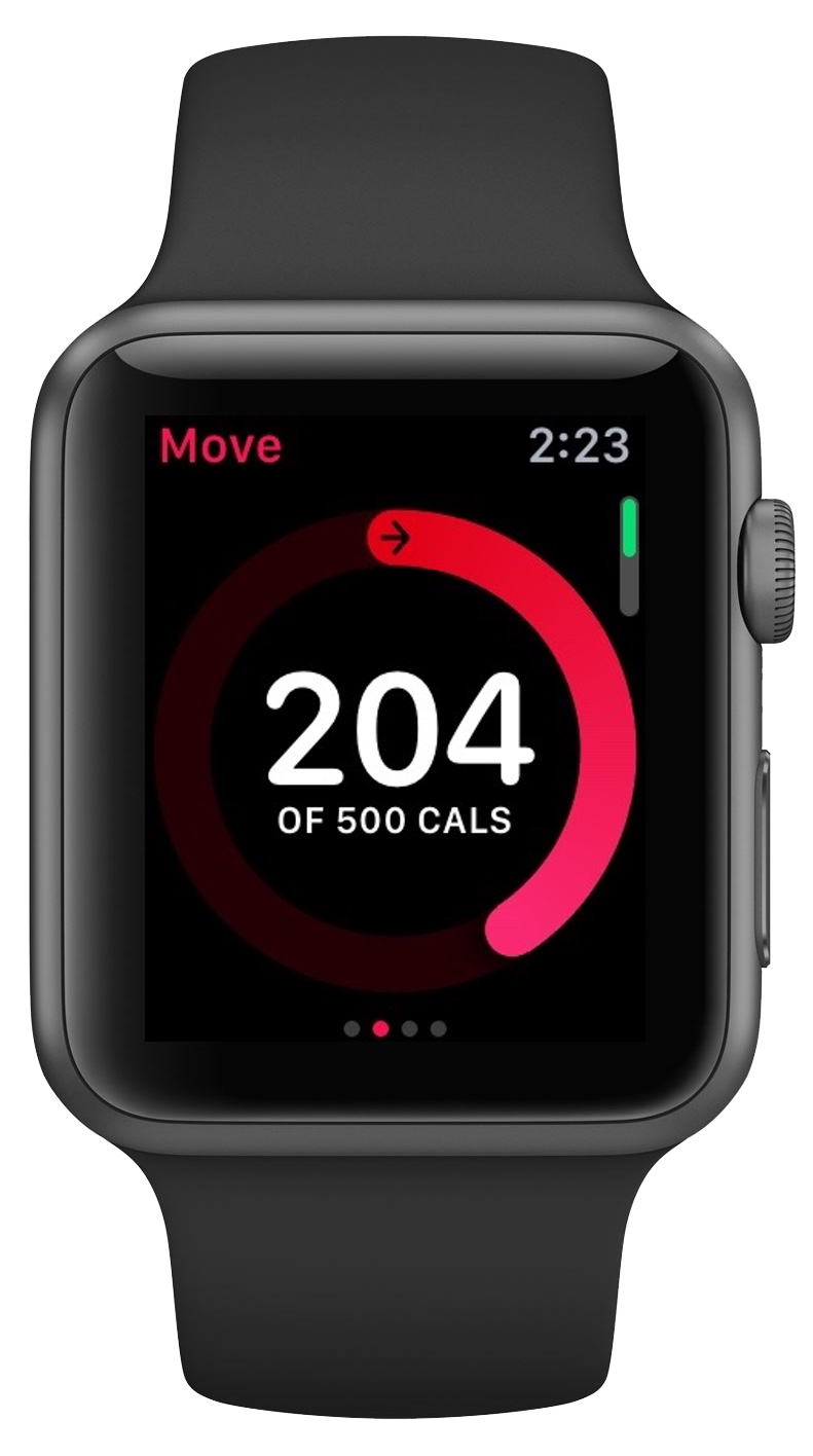
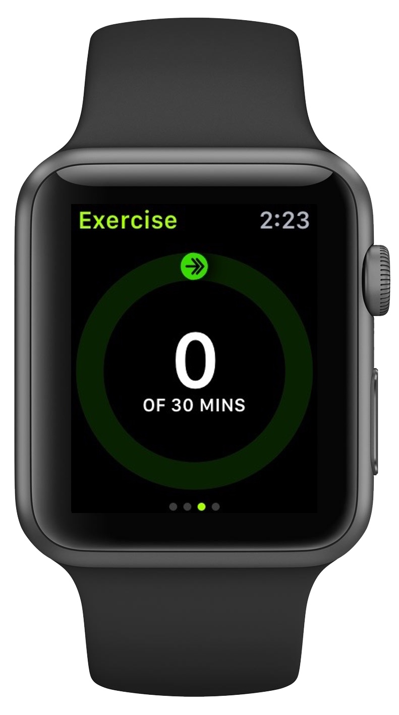
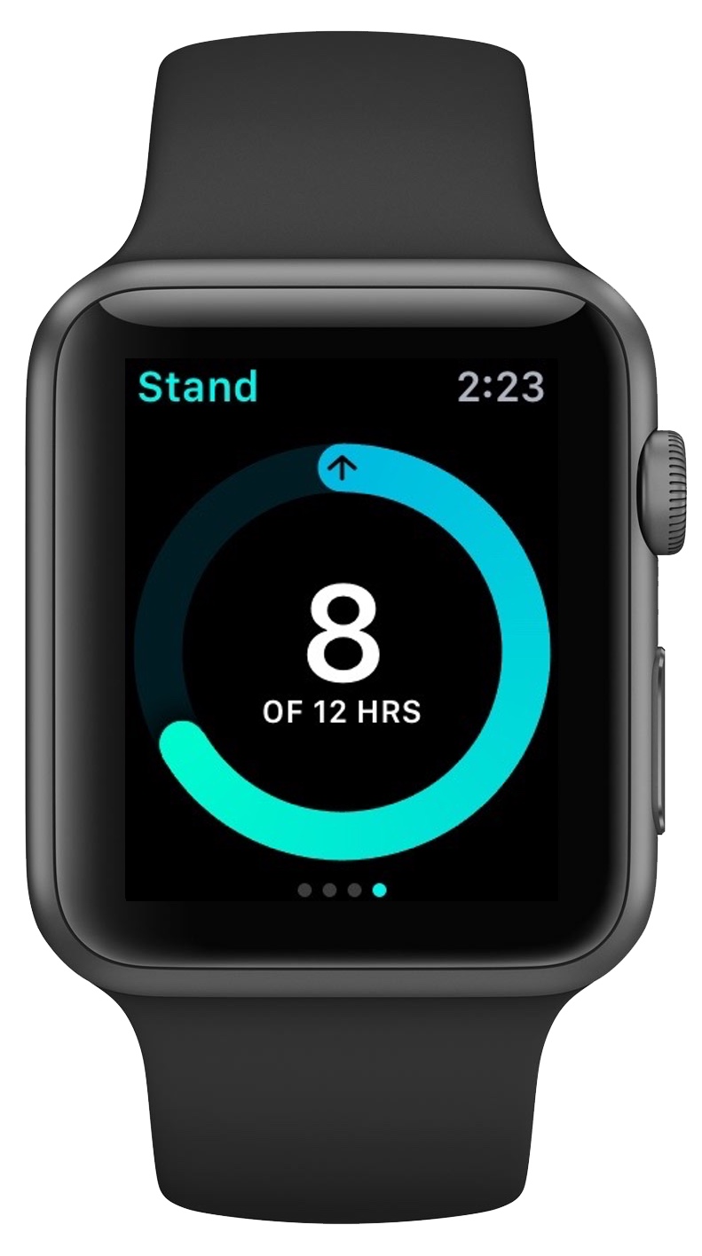
Each day, the watch monitors three things; your movement (recorded in calories burned), your exercise (anything that raises your heart rate above that of a brisk walk) and how much you are standing throughout the day. These are represented as three concentric rings. At the start of each day they are faded out, or empty. As the day continues, you fill up each ring with the goal being to complete every ring. The most "difficult" one to fill is the exercise ring. So much so that AJ and I often talk about needing to work on our green ring. What this means is that I'm looking for opportunities throughout the day to get my ring filled up so that I have less "real" exercise to do at night. That means I am speed walking throughout the day, I'm happy to park somewhere inconvenient in order to get points. It's also meant that I am walking an extra 2 miles a day or burst training to ensure I get those points.
Not only have I hit my daily goal everyday since I got the watch, I'm also looking at ways to earn the medals that are offered. This means I have to go above and beyond the daily limit. For example, in about half an hour, I'm going out with the goal to go burn 1,000 calories and keep my heart rate raised for an hour to win a bunch of awards. This is something I've been planning (and dare I say it looking forward to) all week. Somewhere along the way Apple has figured out how to motivate people like me. And that's a big deal. (The only thing I'd love to see added to the health side of things is the ability to "compete" with others.)
Conclusion
I've made several references to the original iPhone. In the same way that I loved my first iPhone for what it was (even though, living in Canada I couldn't even use the phone part of it!) I loved it for what it would become. So too with this watch. I really enjoy using it daily. It's deliberately limited - in part because technology has to catch up, but also I think it's been designed with limitations to teach users a new way of interacting with this new piece of technology. I love it for what it can do now and I look forward to what it will be able to do in the future.
